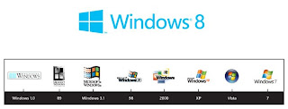
It’s official: Microsoft has confirmed that the Windows 8 logo redesign rumor is true (and that those renderings were pretty spot-on.) At long last — since Windows 3.1 — we may now rest assured that the logo is indeed of windows, and not a flag. This is the point that was raised by the designer who worked on the logo, Paula Scher, to sell Microsoft on the school of thought behind her mockups that aims to bring the Windows logo back to its roots: “…your name is Windows. Why are you a flag?”
 It’s quite a radical change in branding; far more drastic than the revised logo that XP brought to the table. The iconic Windows colors of red, green, blue, and yellow are being ditched in favor of a flat, single-colored flag. The squares are now rectangles. Such a drastic change to a massive, world-recognized brand is symbolic to the risks that Microsoft are taking with the product itself. In the scheme of things, this logo change is probably the least riskiest change to Windows 8 made thus far.
 The flood of negative criticism has already begun to fill my timeline. But, it appears that the Windows logo is already facing left and turning a blind eye to the haters. Good for it.


No comments:
Post a Comment